Technical Analysis is an attempt to project future price trends based on past market price action. Chartists are not bothered about fundamental analysis, they are only interested in analyzing current price movements and comparing these to past data.
A. Technical Analysis Assumptions
- All news, fundamentals, results, etc., are already built into the price. Well, this may be true in steady market conditions but we are sitting on massive volatility where one bit of news can set off an explosive reaction on the charts. So, IMO, I would agree to this assumption only when the markets are more or less steady. I can cite example that support my contrarian views – for example, HEG has below average fundamentals but has zoomed up because of global disruptions. Can cite many more examples, but one will do.
- Stock prices always move in a trend, which can be short-, medium-, or long-term.
- Stock prices will follow patterns/trends that they have exhibited in the past. In other words, history will repeat itself. However, in this day and age of disruption and rapid technological obsolescence, this hypothesis may not hold true in some cases.
B. About Charts
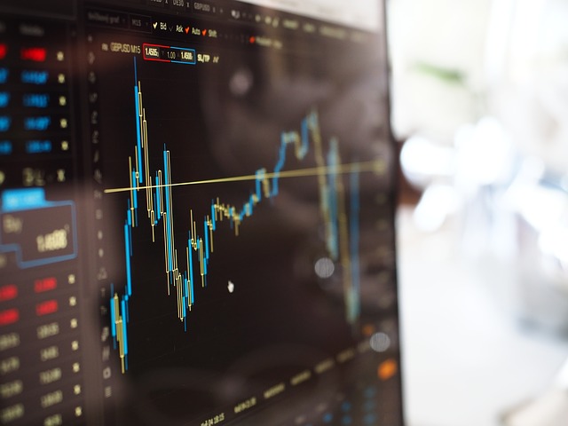
You already may be familiar with how a chart looks. For the record, a stock chart plots time on the X-axis and the price on the Y-axis:
There are 3 types of charts (there are others too, but these three are the most commonly used):
1. Line Chart:
This is how a line chart looks like and you probably have seen it. In a line chart the closing price is plotted per the time period selected and enjoined by a line.
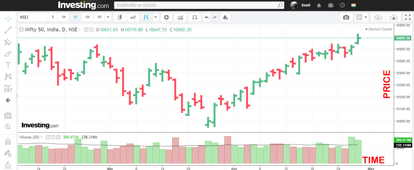
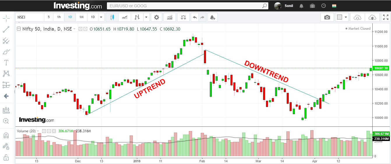
2. Bar Chart – in this chart the open, close, high and low prices are represented on a bar, and each bar on the chart represents the period that you have selected. The Nifty chart above is represented in a bar chart and the green bars represent the time period in which the security closed higher and the red bars represent the time period in which the security closed lower.
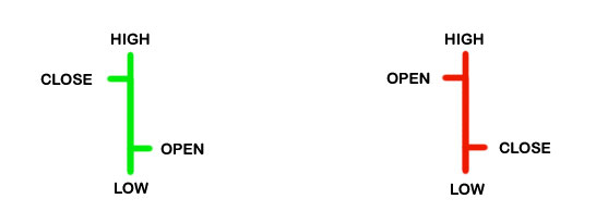
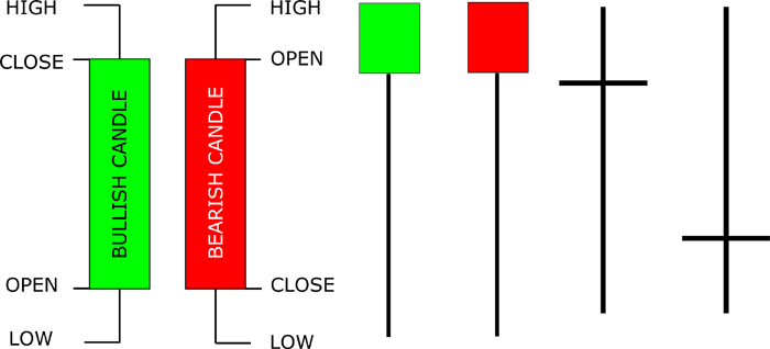
3. Candle Chart
Similar concept as bars, but the candle formations have a lot of variety and one can forecast price movements if he knows how to read candle formations and patterns. To get started with candles, read this article.
C. Price Trends
A trend is a direction in which the prices move.
Many patterns are formed on a chart, and you may have heard analysts saying hings like: cup and handle, heads and shoulders, W formation, trendline, broken out of a trend, blah blah.
There are 3 trend directions:
a. Uptrend: Higher highs, lower lows
b. Downtrend: Lower highs, higher lows. Here is an image that will help you understand uptrend and downtrend on a chart:
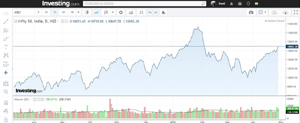
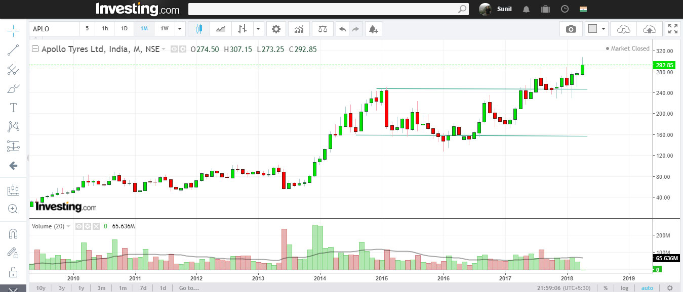
c. Sideways: Also referred to as consolidation before a big move. This is the trend in which the prices remain in a range. Here is an example of Apollo Tyres moved between 160 and 245 for 3 years, and has now broken out of this consolidation phase and seems headed higher (292 now).
Before you attempt to measure trends, read this article on how to draw trendlines first.
Use 1 Hour candles to determine trends for swing trades.
Use 1 Day candles to determine trends for medium term.
Use 1 Week candles to determine trends for long term.
Sub-Types of Trends
You already know the three types of trends – up, down and sideways.
Now, these trends can last long, medium or short term.
Long term trends last for a year or more (See the Apollo Tyres chart above for the long term sideways trend).
Medium term trends last 1-3 months and the Nifty Chart above will help you understand these.
Short term trends last less than a month.
These were the basics on which the foundation of technical analysis is built.
Requested by:
Want to learn technical analysis. Where in bangalore? Who can teach?
— MJ 🇮🇳 (@frendmtweets) March 30, 2018
Sir,
In my approach to technical analysis I give more importance to accumulation and distribution rather than price action. I feel that when accumulation happens and its level rises to new highs market is getting accumulated by strong hands from weak hands and results in a supply shortage of stocks and this will eventually lead to price action as comparatively weak hands will chase the stocks and till fundamentals support this price action and valuation, it will continue.So i believe that accumulation/distribution lines give a good combination of both technical analysis and fundamentals. Sir,Please have a look at the detailed notes on my approach, which i have posted on valuepikr on march 3rd. I couldn’t paste my charts in the comment column. thats why I pasted the link to the post.
http://forum.valuepickr.com/t/bull-therapy-101-cup-and-handle-harmonics-other-breakout/16338/175
The latest charts I have posted in twitter
https://twitter.com/josephseby78/status/990476951574855680
Excellent summation.Is it possible to predict a stock,s tend on previous day,s candlestick chart?
How to predict trend reversal only on basic of chart
How to draw correct Trendlines
Check my article on trendlines.. it’s there in the Charts section
Hello Sir,
In one of your articles regarding MACD & RSI, you have mentioned about “Chartbot”.
Can u help with link of “Chartbot”. I was able to find https://chartbot.com/ChartBot.htm but the options you had shown in that article are not reflecting.
Pls help.
The vendor closed down and I tool it off.. you can try topstockresearch.com
Portfolio restructuring .