Beginner traders and investors often get confused about the time period to set while performing technical analysis.
Depending on the trading style and strategy, you should choose from the following time periods:
- Monthly
- Weekly
- Daily
- Intraday (represented in minutes and hour/s)
Another thing the beginner must know is that volumes are extremely important, and therefore must be tracked.
Here is how you should align each time period to your investment strategy:
MONTHLY CANDLE CHARTS
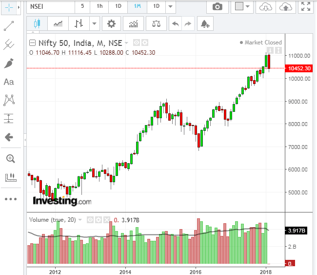
Monthly charts should be used by long-term investors. Such charts display price data that spans over several years, and should be used to spot multibaggers.
Monthly charts should NOT be used by traders, unless that trader wants to discover a long term buy.
Here are a couple of examples:
Note that the fall is supported by rising volumes, a bearish sign.
That said, DIIs can step in to support the market and reverse the trend.

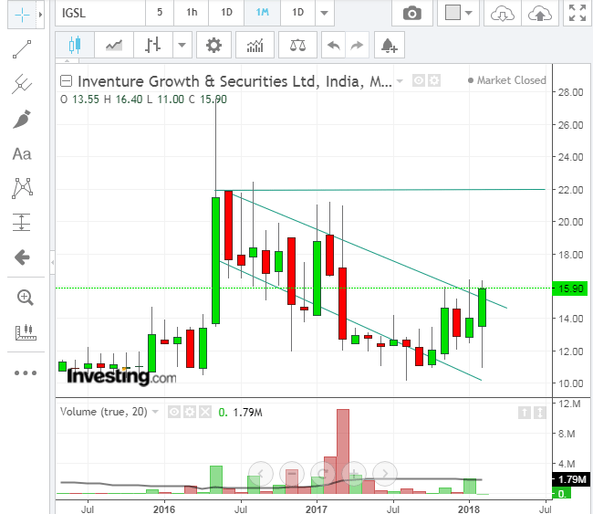
The story of Inventure growth is presented in two charts. This chart represents the period 2012-2016. The stock listed in 2012 and hit a high of 80+. Thereafter, something happened and a huge bearish engulfing candle formed (See (1) on the figure). The stock crashed and never recovered. Now, let’s check the next chart.
WEEKLY CANDLE CHARTS
Weekly charts are used by medium term investors (6 month holding).
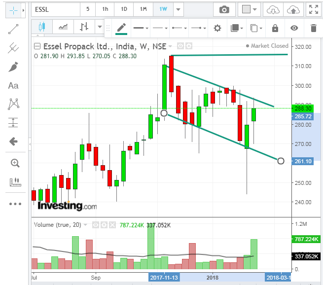
Let’s check the weekly chart of Essel Propack. You may want to understand candlestick formations before attempting to understand this interpretation:
DAILY CANDLE CHARTS
Daily charts are typically used by short term investors and traders who’d like to hold stocks for periods ranging from 3 weeks to 5 months. These charts can also clue investors on to stocks with long term potential. Set the number of days to at least 120-150 while viewing these charts.
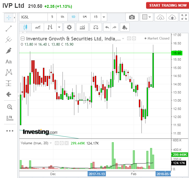
In this example, I tested Inventure Growth on a 1-day chart to check if it generated a bullish signal.
INTRADAY CHARTS
These charts are used by day- and BTST traders. There are different ways to use these charts:
INTRADAY 1-HOUR CANDLE CHARTS
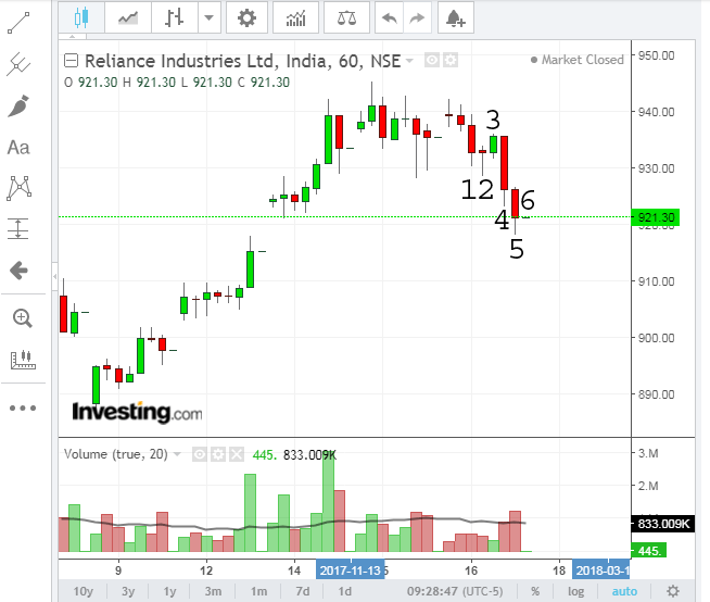
The one hour charts typically give an indication of the day’s (or a major part of the day’s) trend. For example:
15-MINUTE CANDLE CHARTS
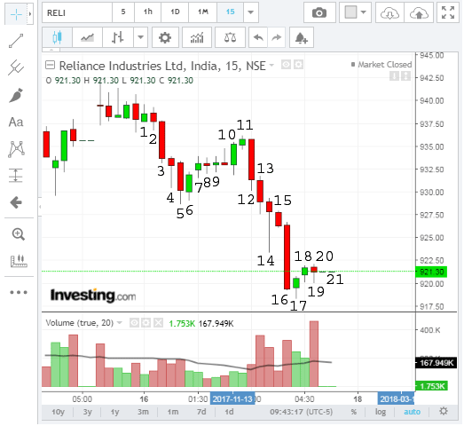
The 15 Minute charts typically give an indication of a trend that should last up to 120 minutes (15 X 8). For example:
IMO, any candle time period below 15 minutes may not be a reliable indicator. However, 5 and 10 minute candle time periods can be studied to form an opinion which should be validated by 15-, 30- and 60-minute candle charts.
Well, this is what you need to know about how to reconcile candlestick time periods with your investment style.
How to draw a channel?Is there any specific rule to draw a channel ?
Good question. I’ll write a short blog post on this.
Check the last two weekly candles. These are with long wicks at the bottom, which indicate bullishness, and that too with volumes. (read the article), Second, the life high is 316, and that the stock is trying to break out of a range (channel). So, for a medium term investor the interpretation is that if Essel breaks out of 367-369 range, it can head to 316 (first target) within the next 6 months.
if Essel breaks out of 367-369 range
i doubt its instead 267-269?
I think it is a typo . It must be 267-269.
Thanks, corrected
THis is still showing as 267-269, should it not be the pricing near the top band of channel, so around 290 ? If the price crosses 290 levels, it can head higher. Pls. advise
15-MINUTE CANDLE CHARTS
The one hour charts typically give an indication of the day’s (or a major part of the day’s) trend. For example:
I think there is some mistake in writing under the 15minute candle chart.
Corrected. Thanks.
good read,thank you.